As I mentioned yesterday, I was inspired to come up with new flags for Las Vegas and Nevada. I looked them up after rewatching the excellent TED talk with Roman Mars about city flags, and deciding I (or almost anyone, really) could do better.
To start, here’s Vegas now:

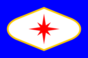
Thanks, I hate it. Here’s my Las Vegas flag:

I despise the current flag with a passion. Why does the stripe not terminate above the lower-right corner, mirroring its placement on the left?!?! And our seal sucks; it features both Hoover Dam and Sunrise Mountain, neither of which is located in Las Vegas. The dam isn’t even in the big valley most people think of as Vegas.
On the previous blog entry, I discussed how symbolism only really matters to the people who have to sign off on changing a flag (which I’ll expand on a bit below). But for that purpose, the elements should be apparent.
The gold outlined white shape is a simplified version of the “Welcome to Fabulous Las Vegas Nevada” sign. The circles for each letter of “Welcome” have been left out, along with the text and surrounding light bulbs. It’s on a blue background similar in color to the poles that the sign is on and its blue text, and the 8-pointed star at the top of the poles has been moved to the center.
Appropriately, yesterday was actually Betty Willis Day in Las Vegas, recognizing the original designer of the sign.
For deeper symbolism, there is actually little to be found in the original sign’s design. The circles for the letters in “Welcome” are supposed to represent silver dollars, as a nod to the “Silver State” nickname for Nevada. That’s about it. I’m sure I could come up with some kind of symbolism if necessary. Maybe the eight points of the star stand for eight important places in greater Las Vegas, and the gold border represents the annexation that Nevada did in 1867 to claim the territory with Clark County and Las Vegas due to a discovery of gold. See, that already sounds real.
Speaking of Nevada, here’s the current design:

And my redesign:

Again, the current flag is underwhelming. Text is bad, you can’t read it from any distance. The motto on it is “Battle Born”, which isn’t even the official motto of Nevada (which is “All for our country,” and would also be bad).
My redesign is very unique among flags, as far as I can tell. Its use of a simplified outline of the state’s shape on the right, and flipped on the left, results in a distinct look.
Those state shapes are in an appropriate silver, for the nickname of “Silver State.” I didn’t realize how much silver there was in Nevada, and how accessible it was. There are reports of people literally shoveling loose chunks of it up off the ground when they arrived. The star appears in the same color, to minimize the necessary pallet and keep an element from the previous flag.
As I learned a bit more about heraldry, the use of elaborate crests and shields to represent family lineage, I discovered some interesting things about how colors were described, which has largely translated over to flags. Notably, when they said “silver” or “gold”, they meant white or yellow. That was largely due to limitations in dyes and paints. So the current flag, which is supposed to have a “silver star” as well, could be in white and fulfill that meaning. It frequently appears that way. But I definitely want a 20% gray for silver here.
These three colors (silver, red, blue) also represent the combined colors of the two major state universities here, UNLV (scarlet and gray) and UNR (blue and silver).
The silver and blue colors in the center also draw inspiration from the “battle born” identity for the state, as the Civil War uniform colors of the Confederacy and Union soldiers. The addition of the red border pushed inwards by the Nevada shapes that surround the center reflects how Nevada’s statehood was itself a massive effort to hold the Union together.
If you couldn’t tell, the last couple of statements have been the kind of bullshit you’d present with the proposal to convince someone to sign off on a design. I wasn’t really thinking about how the three colors were for the state schools, or how silver and blue are for the Civil War uniforms, or how red does the unity thing. It just looks good, and does an impression of the semi-patriotic red/white/blue thing.
But it sounds really nice, doesn’t it? It would make for a great unveiling speech, I’m sure. I could even add more, like something about the upside-down funnel shape in the center representing Nevada (the star) shining as a beacon of freedom that is always reaching upward for a better tomorrow. There’s probably a trick to limiting the symbolism claims to make the totality seem plausible to the audience.
Anyways, let me know if you like or hate my ideas. I’m going to post them on the subreddit for flag nuts, r/Vexilollogy, which I am sure I will spend way too much time on in the future. Cheers.